Art Style Discovery
Discovering the art style for Entity.
Originally, Entity would have a very simple, saturated, flat look to the game. Time progressed and I looked into different forms of art.
|| You may ask, why not just stick with the flat colour look? Well I found that it has been done in games before. This game is one of its kind so the art style should reflect that. Sometimes to look for something new, you must look to the past to reinvent for the new.
Entity would still have a simple polygon look, so I started looking at the art form Cubism and what it had to offer. It offered.

These are a few examples of the cubism that I found. What I loved about the cubism is the use of colour, the perspective, and the roughness. I realized that I wanted to being all these elements in the art style for Entity. The colour is vibrate stands out from warm to cool colours. The perspective is all over the place. Having the perspectives change between inside the paintings bring surrealism and a fantasy aspect to all the paintings. The roughness is what sold me when looking at cubism. The roughness brings texture and dimension to the paintings.
I attempted to find more modern examples of cubism. I found 80’s style posters keeping with the same aspects that I loved in the cubism paintings.

These 80’s style posters mixed a great polygon creation with the roughness and colour blend methods of the cubism paintings.
Lastly, I found a music video by C2C, Delta, which captured the art style well within movement and animation.

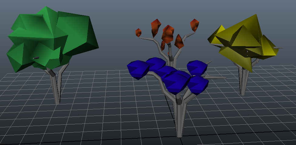
The art style will be future edited and messed with. But from the research and testing phase, a proper sandbox was created for the Entity game :

For more Entity art style, and all Entity needs keep checking out our blog!